5 Things You Need to Remove from Your Website NOW (and Why)
5 Essential Elements For A Good Website Design
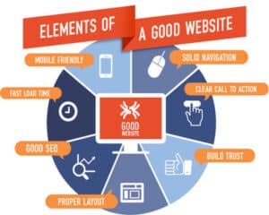
A big part of good web design is making sure your website has the important elements it needs, such as:
- 1. Logo
- 2. Straightforward navigation
- 3. Easy-to-find contact us information
- 4. Helpful blog content
- 5. Search engine optimization (SEO) keywords
5 Things To Remove From Your Website
Yup. Those are all excellent things to have.
On the other hand, there are some website additions that may seem like a good idea, but in reality, they're not.
That’s because they’re distracting, unnecessary, cluttering, or just plain useless.
What are these digital pests? Do you have them on your website? How can you get rid of them?
That’s the focus of this month’s Money-Making Monday Tuesday, courtesy of WEB ROI.
1. Email Addresses
Wait, what?
You might be thinking “if I don’t share my email address, how will people get in touch with me?”
The answer: An easy-to-use form on your contact us page.
Those emails you get begging you to send $4,000 to a Nigerian prince so he can send $4,000,000 back to you? That’s a spam robot at work.
That evil robot:
- Crawled the web
- Found your email address
- Decided you needed to know about this brilliant get rich quick scheme
Even worse? You’re going to keep getting those annoying emails.
From a return-on-investment (ROI) perspective, it’s nearly impossible to track what emails are really doing for you.
Email links can’t:
- Be measured in Google Analytics
- Lead to thank you pages
- Ask the user-specific questions
- Route messages to the right people (why is Frank the custodian getting eCommerce emails?)
In short: Email addresses on your website are terrible for marketing but great for spam.
What You Should Do Instead
Take the hatchet and remove every email link on your site. Every. Single. One.
Relax, you’ll still connect with people via a strong email marketing program. Once those email links are gone:
- Build a pleasant contact us page with an easy-to-use form that’s not intimidating and doesn’t ask for too much information.
- Create a nice thank you page with extra content and an auto-responder email telling whoever filled out your form you’ll be in touch.
When it’s all ready to go, set up your thank you page as a goal in Google Analytics.
That way, whenever someone reaches that page, you’ll know exactly what they did and how they got there.
2. Auto-Play Videos and Music
Your website is a place to promote your business, showcase work, and allow people to get in touch with you.
Know what it’s not? A movie theatre or concert hall.
Videos and audio clips are great to have. But if they start to play automatically, you are going to startle your visitors. Guaranteed.
When that happens, they’ll either:
- Frantically search for the volume control on their computer, or
- Close your website altogether (that’s easier, faster and safer)
Now, instead of welcoming people to your website, you’ve scared them half-to-death.
And because they’ve had an unpleasant experience, the chances of them coming back to your website are slim.
What You Should Do Instead
Videos and audio clips are good. Don’t take them off your website. You just need to make some modifications to how they’re presented:
- Disable the auto-play feature immediately. Do not pass go. Do not collect $200. Do this now. RIGHT NOW.
- See the first bullet listed in this section.
- Use subtitles so people can follow along with the video without bothering other people or drawing unnecessary attention to themselves.
Did we mention you should shut off the auto-play feature ASAP?
It sounds like overkill, but there’s no better way to annoy and repulse visitors than with video/audio that blares the moment they hit your site.
3. Stock Photography
Many years ago, the Neilson Norman Group (NN/g) – a leading authority in web design – conducted a study about pictures used on websites.
Guess what the most hated, cliché, annoying, useless image a website can possibly feature is.
This one right here ⤵
Here's what people think when they see this image:
- 1. Working in a call centre isn't a happy, pleasurable experience.
- 2. People aren’t spending hours on hair and makeup to work at a call centre.
- 3. Call centres aren’t that clean.
In short: People aren't buying it.
People can smell an unreal stock photo a mile away. According to MarcelDigital.com, stock photos can negatively impact conversion rates when it comes to measuring results.
Another statistic: MarketingExperiments.com found that the webpage with an image of a real employee received 35% more conversions than the same page with an obviously stock pic.
Stock pictures aren’t authentic. And nobody wants to do business with a website that isn’t perceived as genuine.
What You Should Do Instead
If you need to use stock images, invest in the top package you can. The pictures are better and more creative. However, nothing beats the real deal.
- Have a company picture day where everyone dresses up. It’s much better to have a real image of Anne from customer service as opposed to a fake.
- Are you a contractor? Invest in a high-quality camera and take before/during/after pictures of your home improvement projects in action.
Lastly, when in doubt, snap a selfie with your smartphone.
It may be unpolished and not professional-looking, but it has more authenticity than this…
4. Useless 404 pages
A quick refresher: A 404 page is what you get when the web page you’re looking for doesn’t exist.
Ideally, you shouldn’t have any dead pages on your site. Every link should point to a live, active and interesting page.
But if you do have 404 pages, don’t make them boring or empty. Basically, they’re telling the user there’s nothing to see and there’s nowhere to go.
Except away from your website and over to your competitors.
404 pages are a great way to showcase your company’s personality and alleviate some frustration the user is experiencing (after all, they want to visit a page that’s not there).
Just because 404 pages are bad doesn’t mean they should be boring.
What You Should Do Instead
- Test every link and page on your website.
- Make sure they all work and don’t point to any dead, empty, or non-existent pages.
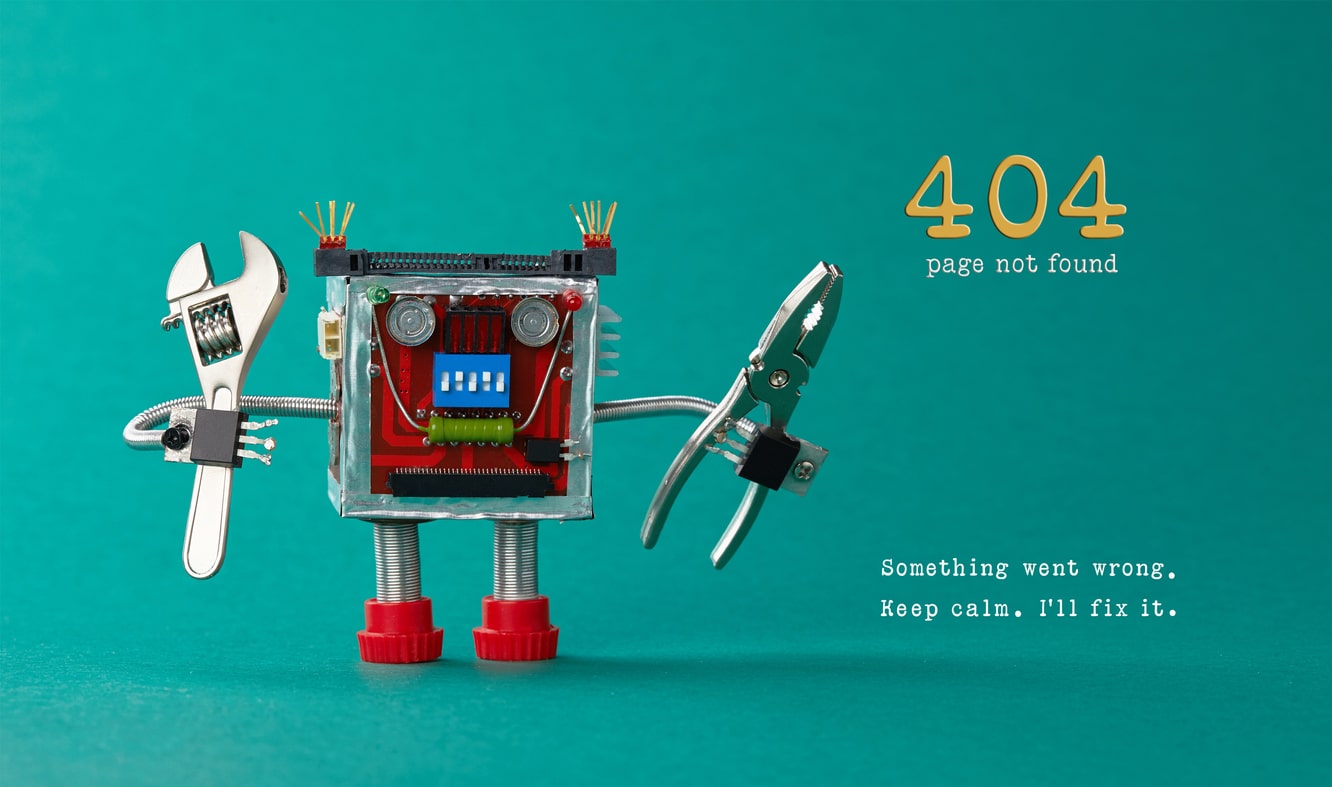
- Then, you can create a super-cool 404 page. (Like the one featured here, courtesy of Dawdle)
- Write a funny apology message. Something like “Oh no! It looks like aliens abducted this page. We’ve sent space rangers after them.”
- Give people clear options where to go next, such as back to your homepage. Or encourage them to read some case studies or visit your about us page.
Whatever you do, just don’t leave them hanging. A 404 page is like a dead-end.
In the real world, you’d turn your car around.
In the online world, people can just smash through it (by leaving your website). Don’t give them that option.
Want to learn more, contact our experts at WEB ROI today. We are happy to help!
5. Long, Jargon-Filled Paragraphs
In his classic book on writing, Hey Whipple, Squeeze This, Luke Sullivan explains why the stop sign is the most effective communication piece ever written:
“(A stop sign) is relevant. It’s simple (and easy to understand). It says STOP.
It doesn’t say ‘please bring your vehicle to a speed not exceeding zero miles per hour at this coordinate in space and time as there is other vehicular traffic moving in a direction perpendicular to your own and may intersect with your vehicle’s current trajectory.’
It says STOP.”
The content on your website needs to be that short and simple.
For example, if you’re a niche retailer selling dog treats, do not say you offer “canine delectables”, say you carry dog treats.
People don’t read long copy blocks, they skim looking for certain words.
If your content is long – and filled with complicated words – people will find your website uncomfortable and go somewhere else.
What You Should Do Instead
First, look at and read every word on your website.
Are they presented in big, long chunks? Do they use jargon your prospective customers will understand? If they do, it’s time to edit:
- Break up your paragraphs into 2-3 lines (at max). Use sub-headers to introduce what each section of the page is about. Use bullet points to highlight important items.
- Simplify your text. Remember, you’re not writing it for you, but for people who want to buy from you. It must appeal to them.
When it comes to your products or services, your visitors only care about what benefits it can provide them.
The copy on your page must answer that question as quickly as possible.
Is It Time To Clean Up Your Website?
No doubt, your website has some valuable information on it.
However, it may have some pesky pieces which are preventing it from delivering the high-quality leads your business needs to grow.
And the last thing you want to do is eliminate the good stuff and retain (or even enhance) the bad stuff.
It’s like that classic song by the Clash, Should I Stay or Should I Go?
Need help identifying what needs to be removed from your website? Contact us with your questions or comments.
Download your FREE copy of 6 Guaranteed Ways to Drive More Qualified Leads.


